THE PANT PROJECT × OPTIPHOENIX: LARGER HOMEPAGE CATEGORY ROUNDELS DROVE A 3.73% CONVERSION RATE UPLIFT
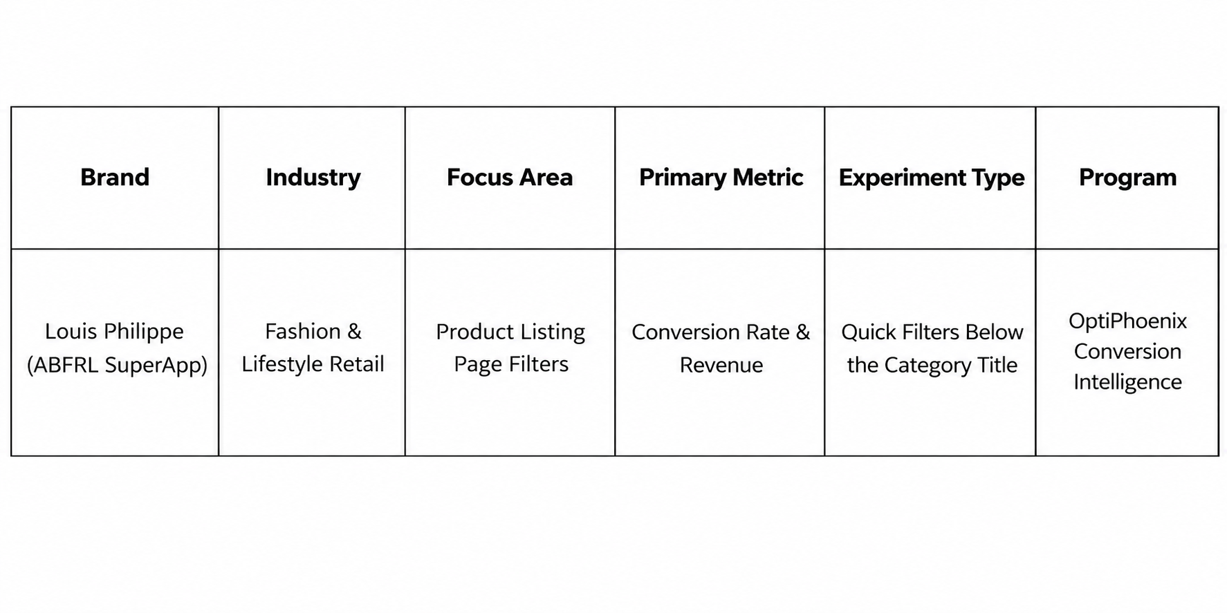
Louis Philippe is one of the brands available through the ABFRL SuperApp, a unified fashion shopping platform that brings together brands including The Collective, Louis Philippe, Van Heusen, Allen Solly, Peter England, Pantaloons, American Eagle, and Forever 21 into one shopping experience. On the Louis Philippe Product Listing Page (PLP), users had to open the filter drawer before they could refine products. Frequently used filters such as Color and Product Type were not immediately visible. This added an extra step to browsing and made it slower to narrow down products.

OptiPhoenix partnered with Louis Philippe to test whether exposing high-intent filters directly on the page would reduce that friction and improve conversion.
Shoppers on a listing page usually know what they want to narrow down by. Color and product type are the filters they reach for first.
But those filters sat behind the filter drawer. Every refinement meant opening it, choosing an option, and returning to the results. So the gap sat between shoppers who were ready to refine and a page that made the most common filters take extra steps to reach.
OptiPhoenix proposed exposing category-relevant filters, such as Color and Product Type, directly below the category title. Shoppers could then refine listings without opening the filter drawer. This was expected to speed up product discovery, reduce navigation effort, and lift the conversion rate.

OptiPhoenix ran a controlled A/B test on the Louis Philippe Product Listing Page.
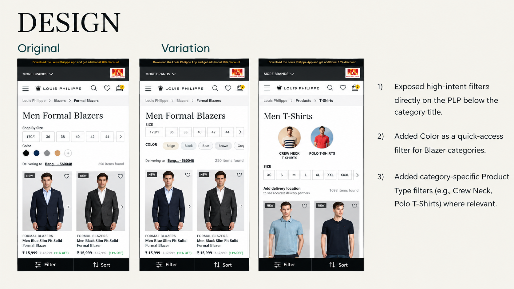
Variant A (Control): The original PLP, where users opened the filter drawer to refine products.
Variant B (Test): High-intent filters exposed directly on the PLP, below the category title. Color was added as a quick-access filter for Blazer categories. Category-specific Product Type filters, such as Crew Neck and Polo T-Shirts, were added where relevant.
Metrics measured: Conversion Rate, Revenue, and Top Filter interaction.
Putting the most-used filters in plain sight helped shoppers reach relevant products with fewer interactions.
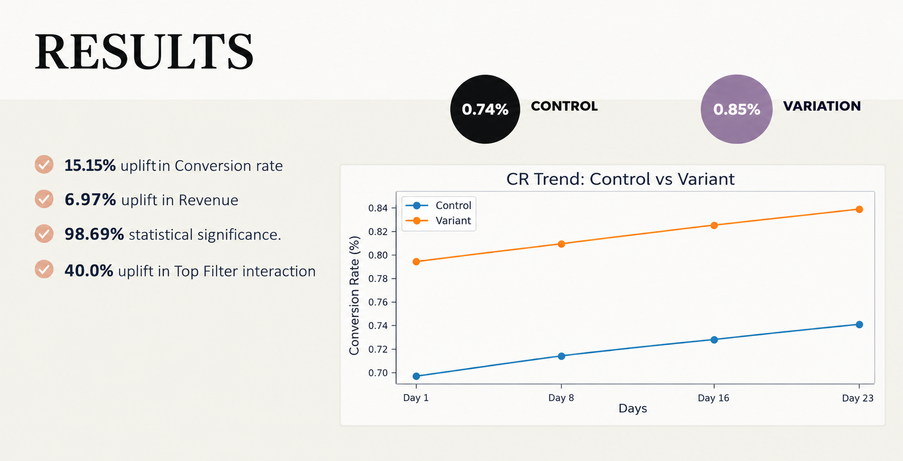
Conversion Rate rose from 0.74% to 0.85%, a 15.15% increase, reaching 98.69% statistical significance. Revenue rose 6.97% over the same test. Top Filter interaction rose 40.0%.
Surface the filters shoppers use most. Color and Product Type did not change. Moving them out of the drawer and below the category title made them far easier to use.

Fewer steps raise engagement. A 40.0% rise in Top Filter interaction shows that shoppers wanted to refine. The extra step in the drawer was the barrier.
Tailor filters to the category. Color for Blazers and Product Type for categories like T-Shirts matched the filter to how people shop that product. Generic filters would have been less relevant.
Louis Philippe‘s shoppers were not avoiding filters. They were slowed down by a drawer that sat between them and the products they wanted. By exposing Color and Product Type filters directly on the listing page, OptiPhoenix removed that step. Conversion Rate rose 15.15% and Revenue rose 6.97%.