LOUIS PHILIPPE × OPTIPHOENIX: QUICK FILTERS ON THE PRODUCT LISTING PAGE DROVE A 15.15% CONVERSION RATE UPLIFT
On a wellness brand’s product page, the subscription is usually the better deal for the shopper and the more valuable outcome for the business. Getting a buyer to choose it depends on whether they understand what they are getting. On Pique’s PDP, that understanding was missing.
The original design stacked the subscription and one-time options as tabs on top of each other, each showing little more than price and delivery timing. A shopper could see that a subscription existed, but not why it was worth choosing over a one-time purchase. The perks that make a subscription compelling were not on display at the point of choice.
The behaviour followed the design. Shoppers were adding and buying more one-time than subscription: 51% of add-to-cart actions were one-time against 49% subscription, and at purchase the gap widened to 57% one-time against 43% subscription.
OptiPhoenix partnered with Pique to test whether making the subscription’s benefits visible at the selector would shift that choice.
The problem was not the subscription offer. It was that the offer argued for itself in silence.
The reasons to subscribe, a locked-in discount, recurring delivery, a risk-free trial window, all existed. They just were not surfaced where the shopper made the decision. When the choice between subscription and one-time showed only price and delivery, the shopper had nothing in front of them to justify the recurring commitment, so they defaulted to the simpler one-time option. The gap was legibility, sitting between a subscription that was genuinely the better value and a shopper who could not see why.
If the subscription and one-time choice is consolidated into a single module with a toggle, and the subscription’s benefits are highlighted alongside the price, more shoppers will understand the value of subscribing and choose it.
OptiPhoenix ran a controlled A/B test on the PDP purchase selector:
Variant A (Control): The original layout, with subscription and one-time as stacked tabs showing basic price and delivery information.
Variant B (Test): A single selector module with a toggle to switch between subscription and one-time, with the subscription’s benefits, such as the locked-in discount, the delivery cadence, and the risk-free trial, highlighted next to the price.
Metrics Measured: subscription take rate, add-to-cart mix, purchase mix, cart abandonment, revenue
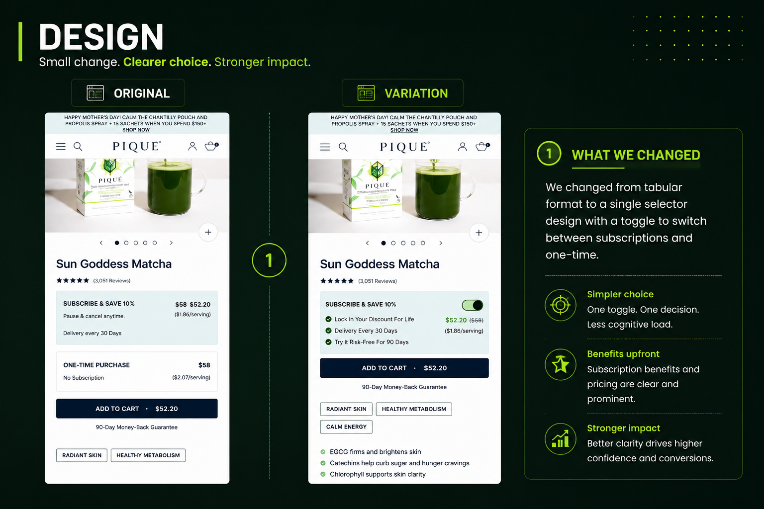
Making the benefits visible at the toggle changed which option shoppers chose.
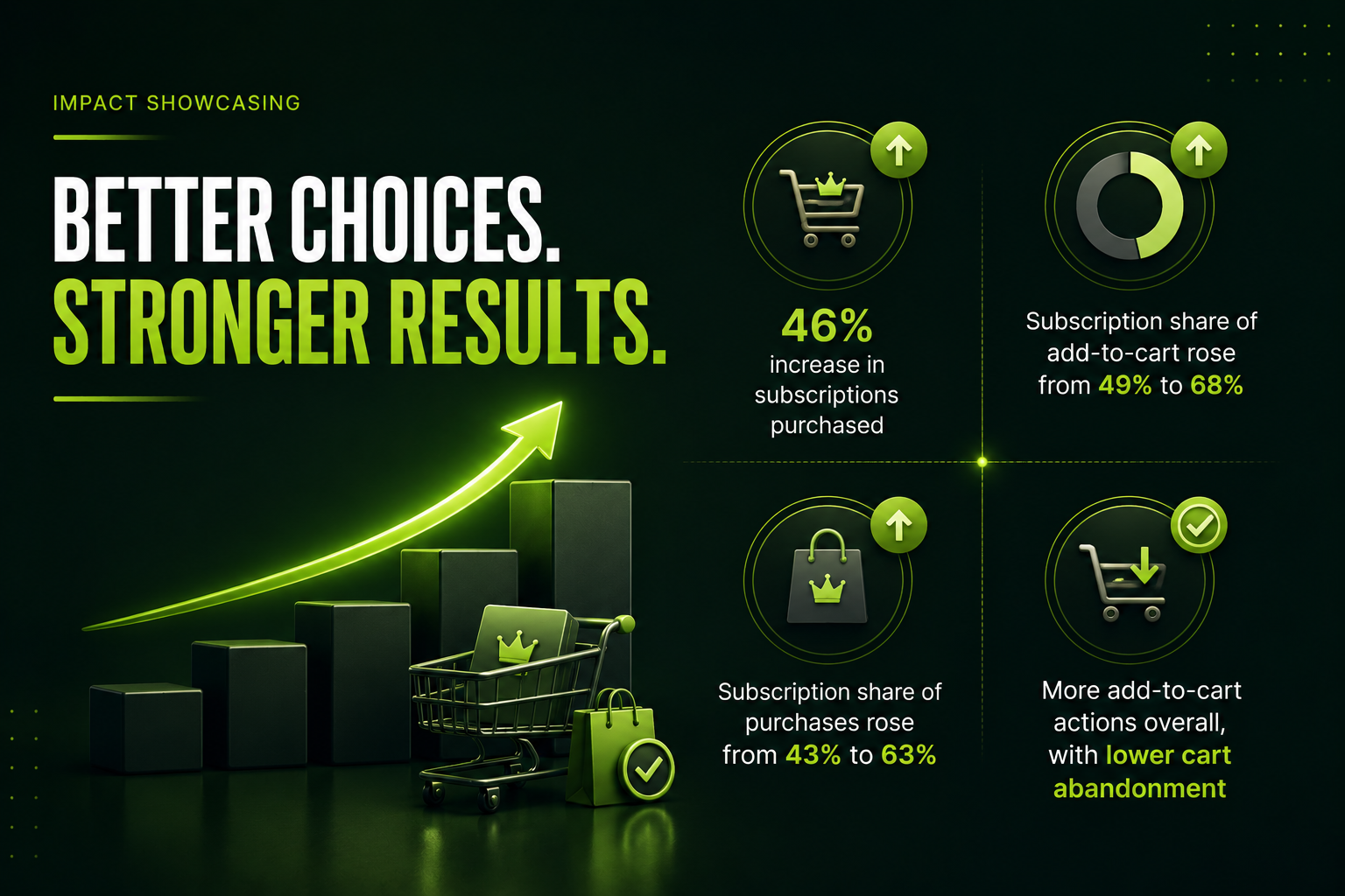
Subscriptions purchased rose 46%. The add-to-cart mix moved from 49% subscription to 68% subscription, with one-time falling from 51% to 32%. At purchase, subscription share rose from 43% to 63%, with one-time dropping from 57% to 37%. Add-to-cart actions increased overall, and cart abandonment fell.
Consolidating the choice into a single toggle and surfacing the subscription’s benefits lifted subscription purchases by 46% and moved the majority of buyers onto the higher-value option.
A subscription wins on visible value, not on its presence in the layout. The perks were always there. Surfacing them at the moment of choice is what moved shoppers onto the recurring plan.
Consolidating a binary choice lowers the cost of deciding. One module with a toggle asked less of the shopper than two stacked tabs, and the clearer comparison made the better-value option easier to pick.
Legible benefits steer buyers toward the higher-value option on their own. No discount was added. The subscription’s existing advantages, made visible, were enough to shift the majority of purchases.

Pique’s subscription was already the better deal. Shoppers just could not see what made it better at the moment they chose. By consolidating the choice into a single toggle and putting the subscription’s benefits next to the price, the stronger option became the obvious one, and most buyers took it.