
LOUIS PHILIPPE × OPTIPHOENIX: QUICK FILTERS ON THE PRODUCT LISTING PAGE DROVE A 15.15% CONVERSION RATE UPLIFT

The tradesmen quote form opens with two decisions: which day, and what time. On the original form, those choices sat inside a monthly calendar and a flat list of time slots, with no signal about which options were better value or more available.
That left users to work through a dense interface with little guidance, at the very first step of booking. A first step that asks for effort without direction is where people stall.
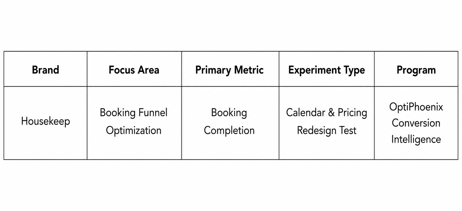
OptiPhoenix partnered with Housekeep to test whether a simpler calendar, transparent pricing, and clearer time-slot grouping would move more users through the booking.
The friction was choice without guidance.
Users were shown every day and every slot with equal weight, and equal weight is no help. Nothing indicated that a weekday differed in price from a weekend, or that some arrival windows were the better pick. Replacing the monthly calendar with a daily view that pre-selected the current day, adding transparent weekday and weekend pricing, and grouping time slots into labelled tiers gave users a path through the decision rather than a blank grid.
If the calendar is simplified, dynamic pricing is shown transparently, and time slots are grouped with guiding labels, the booking journey becomes clearer and more intuitive, increasing confidence and form completion.
OptiPhoenix ran a controlled A/B test across mobile and desktop:
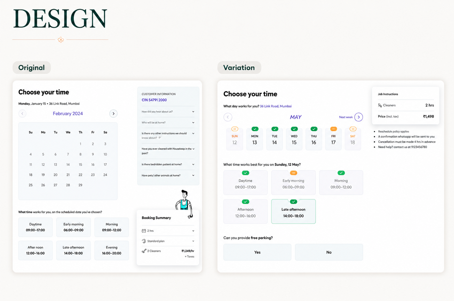
Variant A (Control): The original form, with a monthly calendar and an ungrouped list of time slots, no pricing distinction.
Variant B (Test): A daily calendar view pre-selecting the current day, separate transparent weekday and weekend pricing, and time slots grouped into labelled tiers such as Daytime, Morning Arrival, and Afternoon Arrival.
Device: mobile and desktop. Metrics measured: interaction with weekday and weekend price surge, interaction with time slots, interaction with day selection.
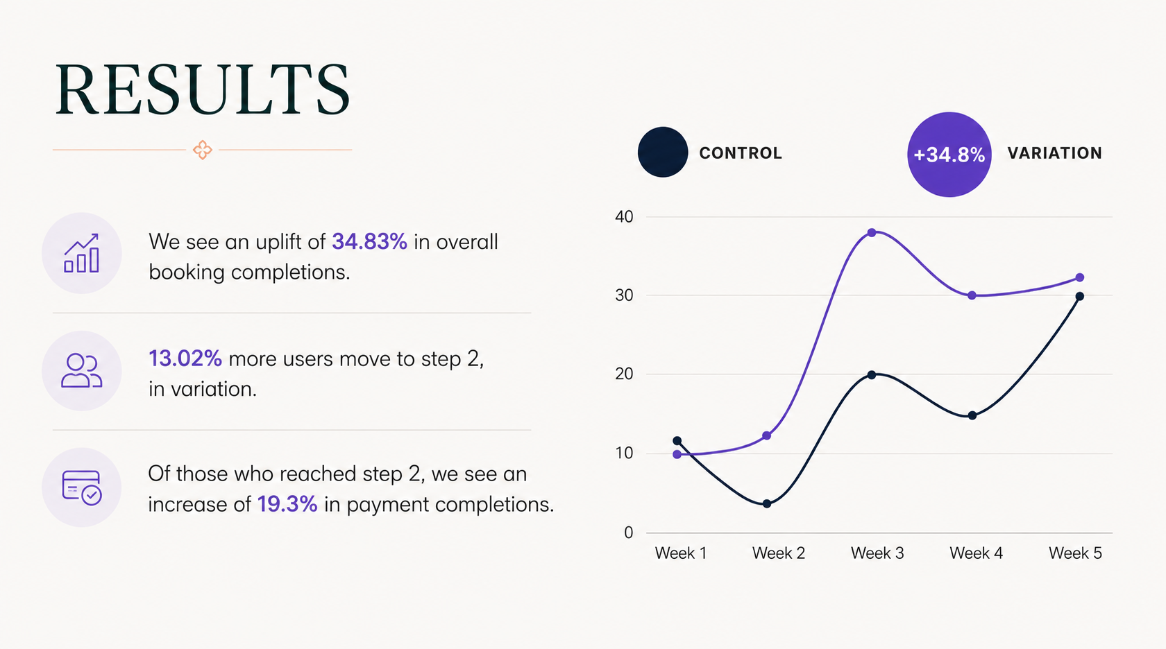
The clearer first step moved more users through the funnel. Overall booking completions rose 34.83%. Progression to the payment step rose 13.02%, and of the users who reached it, 19.3% more completed payment. The result reached 97.60% probability to be best, above the 95% threshold. The data also showed a behavioural pattern worth noting: engagement rose in morning and daytime slots and on weekdays, and fell during evening surge periods and on surge-priced days, with Thursdays the exception.
A clearer calendar and transparent pricing lifted booking completions by 34.83%.
Guidance beats completeness. Showing every option equally was the problem. Labelling value and availability gave users a way to decide.
Transparent pricing shapes behaviour predictably. Engagement moved toward lower-surge days and daytime slots, which is what you would expect once price differences are visible. That is a lever, not a side effect.
Pre-selection lowers the starting cost. Defaulting to the current day gave users a filled-in starting point rather than an empty calendar to interpret.
Housekeep’s users were not avoiding the booking, they were stalling at a first step that gave them no direction. A calendar that guided the choice and pricing that explained itself turned the hardest step into a passable one.